

Audience: Travelers who are seeking information on malaria before going overseas. Intended for travel sites such as the US embassy to provide travelers details on countries that are high-risk Malaria areas.
Responsibilities: Instructional Designer, Storyboarding, Mockups, Visual Designer, eLearning Development.
Tools used: Figma, Articulate Storyline 360
All About Malaria Tab Interaction
The Problem and Solution
Travelers might be overwhelmed by the amount of information presented about malaria, making it difficult to find specific information quickly. To address this problem, this tab interaction allows users to easily click on information that is relevant to them at their own leisure.
Process Overview
I applied core principles from ADDIE, SAM, and Backward Design in clarifying what success looked like for the learner. Using the Successive Approximation Model (SAM), I used a rapid design method to test ideas visually. Lastly, I used a backwards design method to determine content, then designing the learning path.
Text-based Storyboard
I applied my biomedical sciences background as a SME. Using the ‘Foundation for the Support of International Medical Training’ webpage about malaria, I created a storyboard that chunked each section into two paragraphs. I also included a link to the source for further information.
Storyboard example from Title Slide and Slide 1.1 All About Malaria- Content boxes (Description, Risks, Symptoms, Prevention, and Activity) are separated. Image and text condensed on each content box.
Visual Mockups
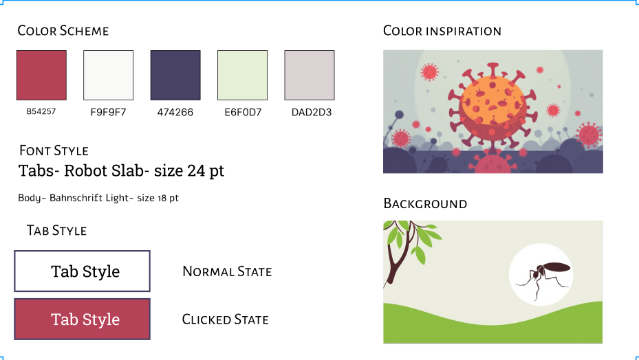
After the storyboarding, Figma was used for the style guide and mockup. The tab is transparent when not clicked and a deep red when clicked for contrast. An infographic of a virus inspired the color palette, with deep red and white text for the tab color, clarifying the content. A mockup of the base layer was created by altering the transparency of the background. The tab interaction placed in front of the background enhanced contrast and readability, particularly for users with visual impairments.
Full Development
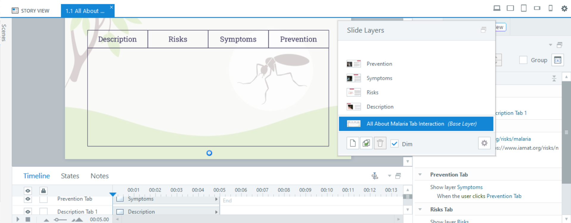
I used layers to add content and images in Articulate Storyline 360. Clicking a tab displays the corresponding content layer. Consistent alignment of content and images ensures a balanced layout and improves readability for users scanning the information.
Through iterations and feedback, I created a low-risk 'Activity' tab with immediate feedback. This tab included short travel scenarios with questions for learners to test their knowledge about malaria. It was programmed with variables and triggers to ensure learners answered 3 out of 7 randomized questions before returning to the base layer. If the user did not answer 3 questions correctly, it was randomized to other questions until they were answered. The user had the option to return to other tabs at any time, maintaining the low-risk accessibility.
Lastly, adding the text-to-speech accessibility feature was crucial for supporting various reading levels and enabling quick access on-the-go. Since the text is science-heavy, this feature helps ensure that everyone can benefit from the information.
-
![]()
Style guide made in Figma for All About Malaria Tab Interaction shows color inspiration, color scheme, font style, and tab style.
-
![]()
Prototype of All About Malaria Tab Interaction highlighting the multiple layers to house the content for each tab.
-
![]()
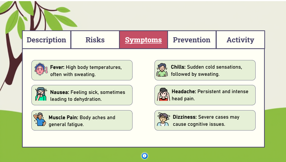
Final development of All about Malaria Tab Interaction.
Results and Takeaways
The key takeaway was managing cognitive load with tab interaction to avoid overwhelming the learner. A simple, user-friendly, and accessible layout helped users navigate the information easily. This tab interaction could be applied to travel agencies or travel embassies to post this as a resource to international travelers.
This tab interaction benefited an avid traveler who expressed, “After using this interactive tool to prepare for my trip to Africa, I’ve become more informed about Malaria and the essential preventative measures I should take to protect my health some of which I had no idea about! The information is made simple for an average traveler like me and now I feel more confident about being safe abroad!”