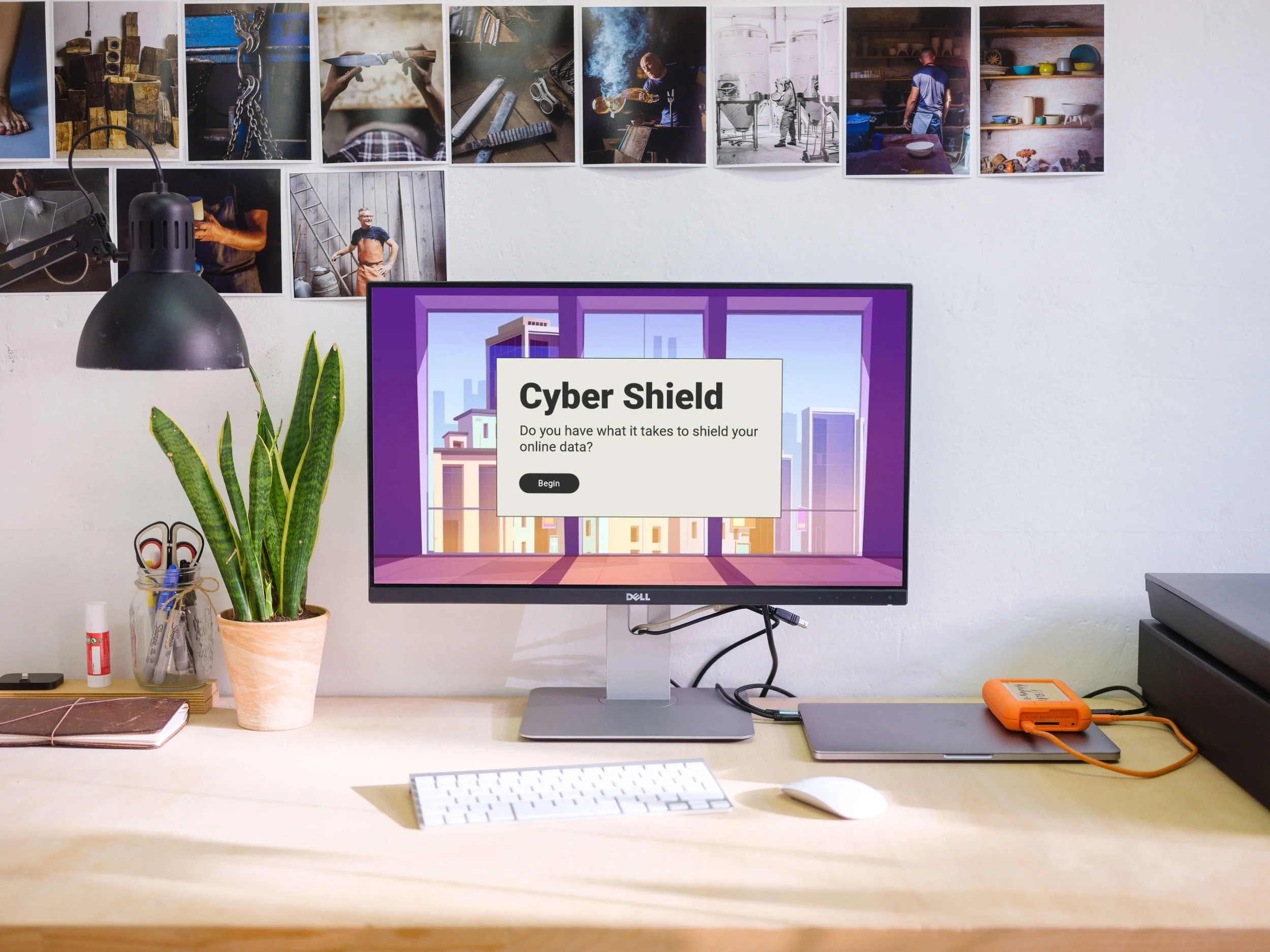
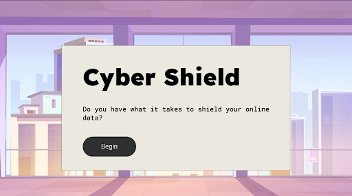
Cyber Shield: Do you have what it takes to shield your online data?
Audience: Remote employees at a financial company.
Responsibilities: Instructional designer, eLearning development, Action mapping, Storyboarding, Mockups, Visual designer
Tools Used: MindMeister, Google Slides, Figma, Articulate Storyline 360
The Problem
Winland Inc. is a fictitious financial services organization based in Dallas, Texas, with 150,000 employees, 90,000 of whom work remotely. Too many of these workers are unsafely opening suspicious email links, being disconnected from the VPN, and using weak passwords. In fact, 47% of employees experience an attempted phishing scam while working remotely.

Overview of the premise of the simulation at the fictitious financial company, Wilman Inc.
The Solution
Since this is a concept project, I researched cybersecurity risks employers could face. After analyzing performance problems, I found gaps in employees' ability to identify fraudulent emails and suspicious links, and in their skills to implement security measures remotely. Cybersecurity awareness training (CAT) helps mitigate these concerns. In this specific training, learners get to practice making security decisions in a safe environment in order to make behavioral changes to work safely online.

Jameela, the Cybersecurity Manager of this company explains the problem of security breaches.
Process Overview
I used the ADDIE model to plan and develop the final product with several iterations and ongoing feedback. This included action mapping, designing the storyboard and visual mockups, developing an interactive prototype, and finally, the full development.
I acted as the SME expert and researched peer-reviewed articles on cybersecurity risks for remote workers. Following proper cybersecurity procedures could decrease malware breaches by 10% within a year. I identified several actions that remote workers can take to mitigate security risks, but for this training, decided on three actions that would have the biggest impact on achieving that goal. Using Mindmeister, I added this goal and three high-priority actions: act on suspicious emails, follow digital security protocols, and use strong passwords. These observable actions emphasize behavioral change by focusing on what people need to do rather than just what they need to know.
Action Mapping
Action map of the project showing the three actions to decrease cybersecurity breaches for remote employees.
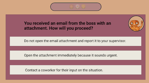
Using feedback on the action map, I drafted the storyboard, which served as the project blueprint. In the storyboard, the three actions served as the scenarios, and subactions were the correct consequences that learners needed to determine. Each choice had immediate outcomes and storytelling elements like dialogue and actions made it clear why certain choices were right or wrong. An optional mentor, 'Cyber Shield,' can be accessed throughout each scenario to guide learners. Changes were made to improve understanding and redirect the learner to make a better choice. If the learner selected an incorrect choice, the story followed a direct negative consequence for their choice and gives them another opportunity for understanding.
Text-based Storyboard

Storyboard example from Scenario 2: Question 2- Choice A Consequence (Incorrect) tells the story of the consequence and redirects the learner to make a better choice.
Visual Mockups
After storyboarding, I used Google Slides to build a style guide, ensuring a consistent look for the project. To bring the visuals to life, I used Figma to design the different slides. A custom high-contrast color palette helped enhance the storytelling.
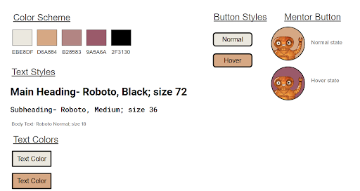
Style guide for the project created with Google Slides shows color scheme, text styles, text colors, button options, and mentor button options.
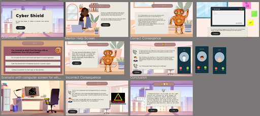
Visual mockups for the project created with Figma show the title slide, introduction slide, mentor slide, scenario slide, access to the mentor help screen, consequences screens, and conclusion slide.
Visual mockups for the project created with Figma shows the title slide.
Visual mockups of the question slide created with Figma.
Interactive Prototype
I used the high-fidelity mock-ups made in Figma as the building block for the prototype. I was able to recreate the layout directly in Articulate Storyline 360, adding interactivity and accessibility features. During this stage, I chunked content into manageable parts and applied animation for clickable components. This strategy would be applied to later scenarios.
Spending considerable time on the prototype ensured that the full development went more smoothly and looked cohesive.
Full Development
After collecting and applying feedback from the prototype, the full project takes learners through an interaction in a financial company where they make decisions based on cybersecurity.
A key aspect of the project was the message interactions between the learner and the office characters. I designed multiple layers so conversations appeared in sequence, making them easy to follow with hidden and normal states.

Results and Takeaway
By implementing a gamified, branching scenario approach, this training targets the goal of a 10% decrease in malware breaches within the first year. To see if the training actually stuck, I would plan a follow-up survey for remote staff. My focus wouldn’t only be on completion scores, but on whether employees could actually spot and report phishing attempts in their day-to-day work.
This concept project provided me the opportunity to broaden my creativity, especially throughout the storyboarding and prototyping phase. Without the storyboarding aspect of the project, it would be difficult to visualize the entire consequence and keep the learning engaging. During the prototyping phase, keeping a consistent design and thinking of the best way to apply the phone conversations were important.
If I were to enhance this project further, I would add audio to create a more immersive experience. Incorporating sound effects for phone conversations or computer pop-ups would make the scenario feel even more realistic.
Overall, I appreciated the expert feedback and the opportunity to think critically about problem-solving.
What People Think
-
![]()
Robert Gutierrez: eLearning Developer and Designer
“Cyber Shield is an outstanding eLearning experience that seamlessly blends engaging graphic design with an interactive, gamified approach to learning.”
-
![]()
Amy Pluto: Instructional Designer
“The smooth flow, thoughtful details, and clean design keep the focus on learning, while realistic scenarios let learners make decisions and experience the consequences firsthand.”
-
![]()
Shekinah Victoria: eLearning and Game Content Developer
“She masterfully applies the Personalization Principle by using a conversational tone that makes the training feel natural and engaging.”
-
![]()
Davis Rideout: eLearning Developer and Designer
“It’s evident throughout her process and final work how masterfully she weaves together Mayer’s embodiment and signaling principles with thoughtful design layouts and intuitive user interactions, ensuring her work is both effective and engaging.”
-
![]()
Greg Bartus: Learning and Development Specialist
“The clean, minimalist presentation effectively eliminates distractions, while her thoughtfully curated color palette enhances the learning environment. Areej's strategic implementation of badging shows considerable insight into current trends.”